Nic Bertino is a design leader, music maker, and disco lover, getting people close to good design.
Good Design
As a design leader, I'm responsible for realizing as much good design as possible while minimizing bad (or tragic) design. Design is constantly changing, but here is what I currently hold as good design:
- Inclusive: an experience or environment meets as many people's needs as possible.
- Gives more than it takes.
- Contextual: design considers the environment that it is invoked, including other users and their community.
- Ethical: the relationship between the design and its user respects agency and controls harm.
- Lightweight: achieving good outcomes requires the minimum amount of effort.
- Aesthetic: a product exceeds its cultural context's visual design and interface expectations.
Rèsumè (PDF) and my Leader README.
Work
Sr. Director of UX, AppFolio 2019-Present
Currently providing design leadership to the Payments, Screenings, and FolioGuard space after tours with our AI initiative and SMB segment. I work within a cross-functional product development group to help teams create B2B and B2B2C products that people love. I've also led our design system effort, providing UI components to 50+ development teams.
Director of Digital Strategy, Santa Clara University 2010-19
Applied Agile product development to digital transformation projects, including apps, websites, touch kiosks, and digital signage. Launched several key projects and initiatives for SCU's most visited properties and authored the University's first accessibility policy.
Senior Web Developer, Trumpette 2008-10
In my last dedicated development position, our small team was responsible for delivering a new eCommerce engine and fulfillment experience.
Web Development, Freelance 2003-19
Everything from WordPress websites to Magento deployments, with a sprinkle of “how to make the worst interface possible” for a Ph.D.’s dissertation.
Major Projects & Impact
2021
Introducing Figma
Supercharged 60+ product development teams through effortless collaboration. Led efforts to integrate AppFolio's design system with Figma.
2018
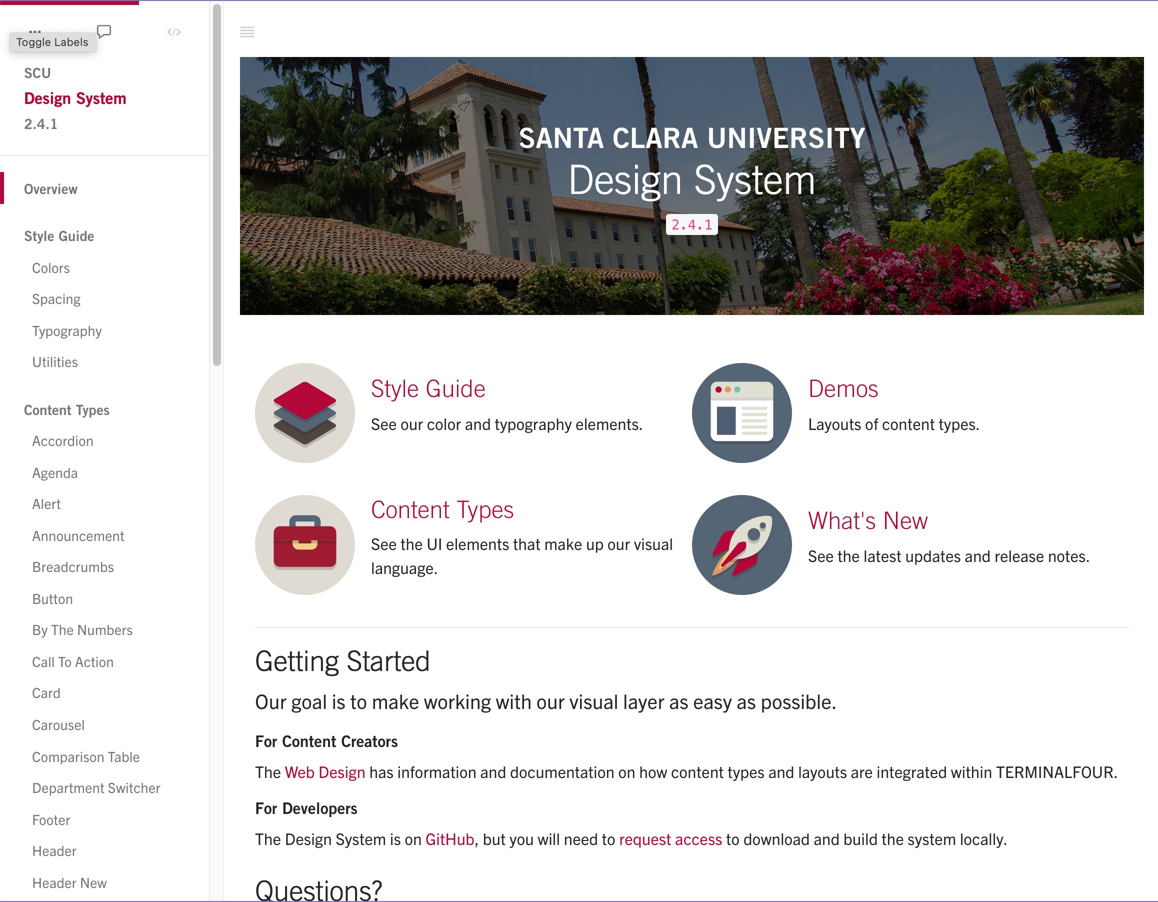
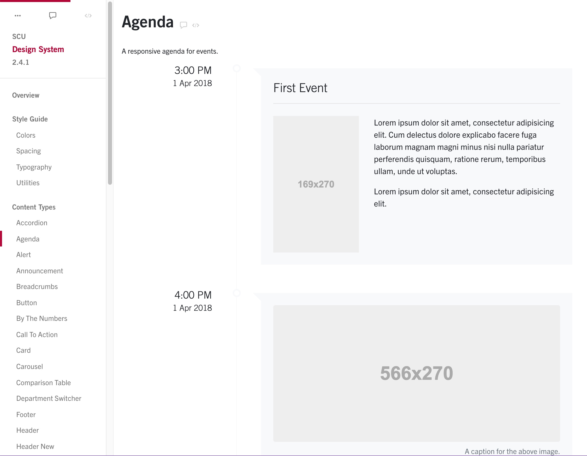
Launched SCU's design system, which powered websites and apps across the University's portfolio. Launched two major UI revisions on properties receiving millions of yearly visits.
2016
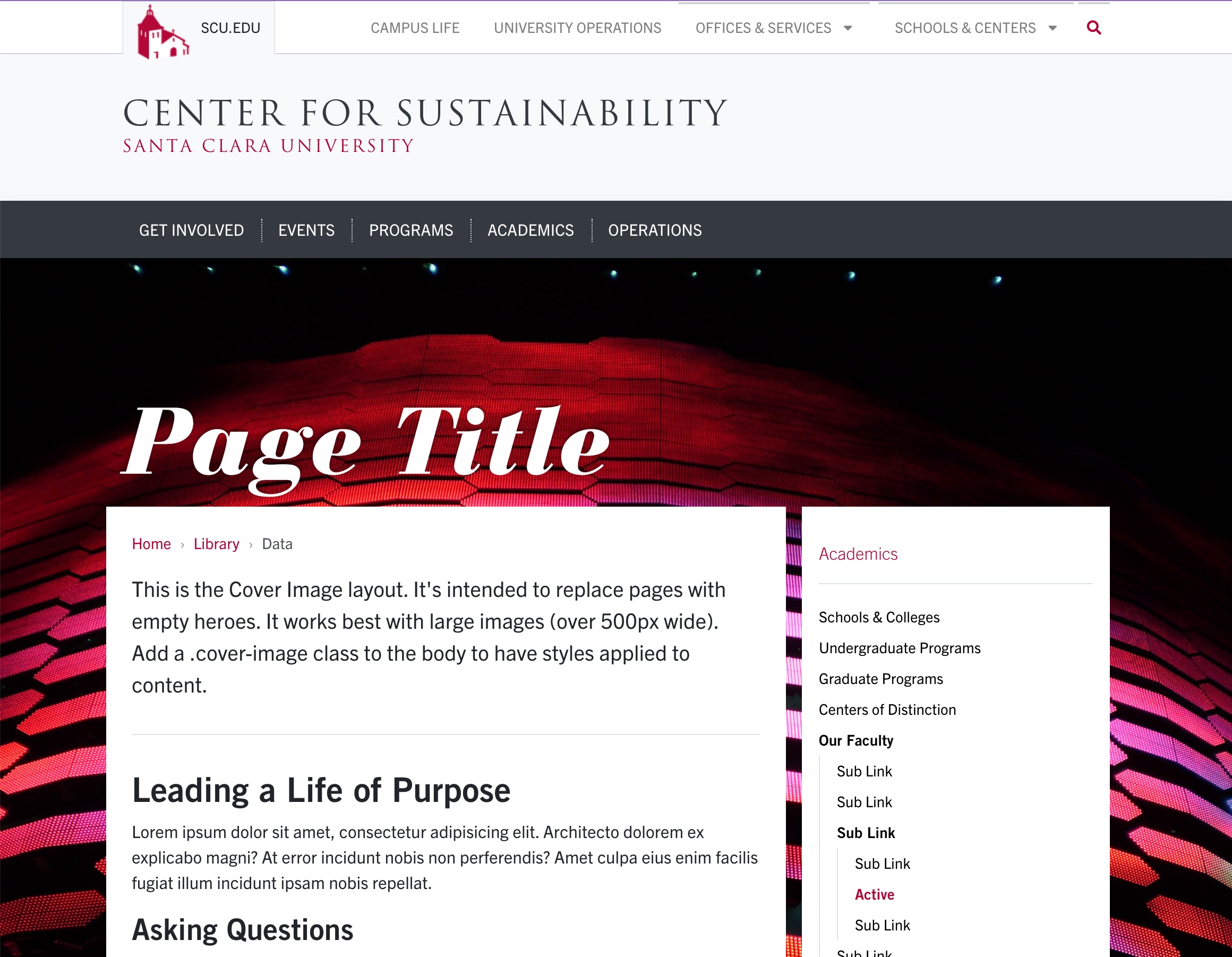
Santa Clara University Website
Successfully launched SCU's major brand and digital overhaul; worked across campus to bring user-centric design to over 40 content owners.
2013
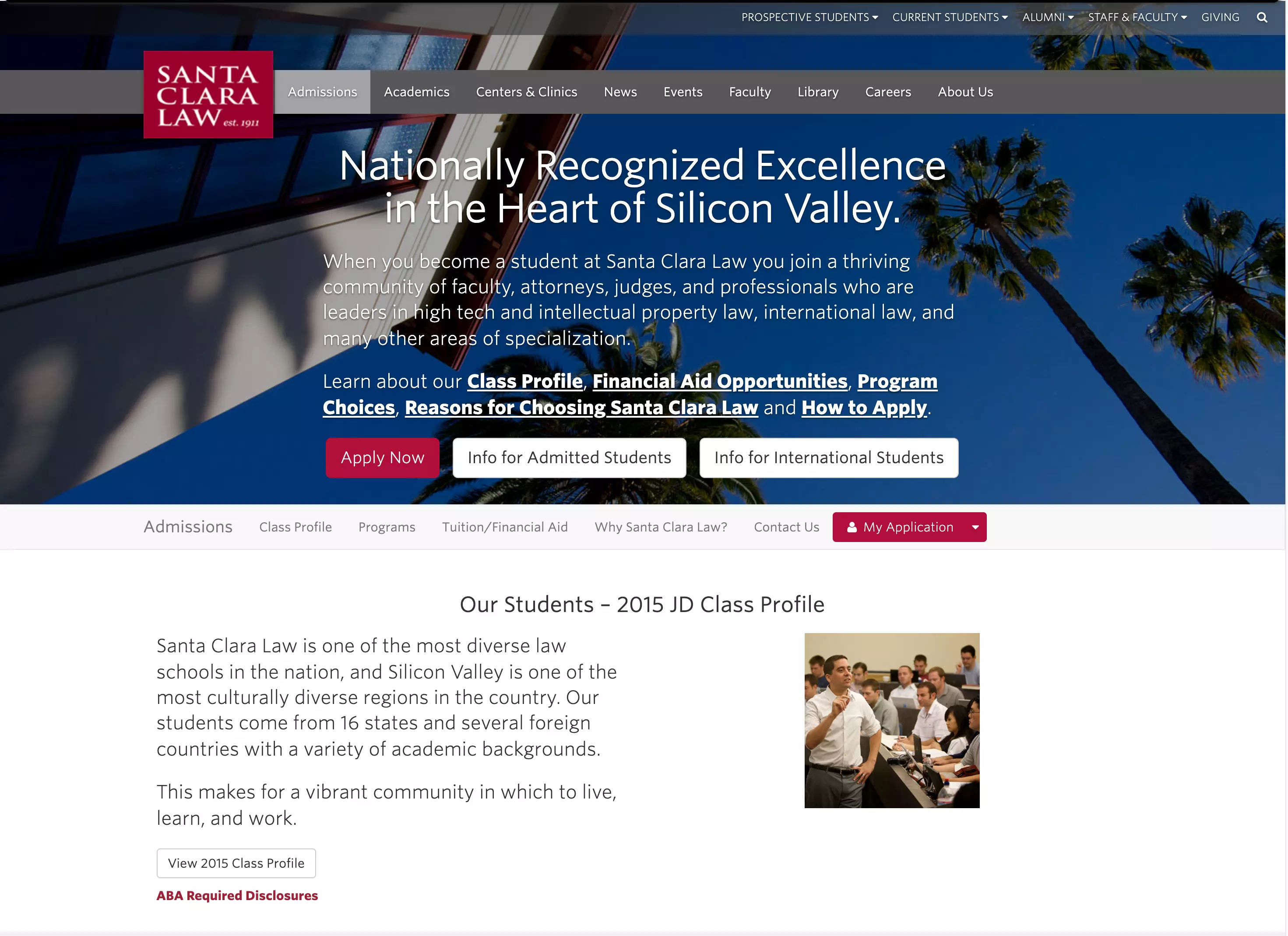
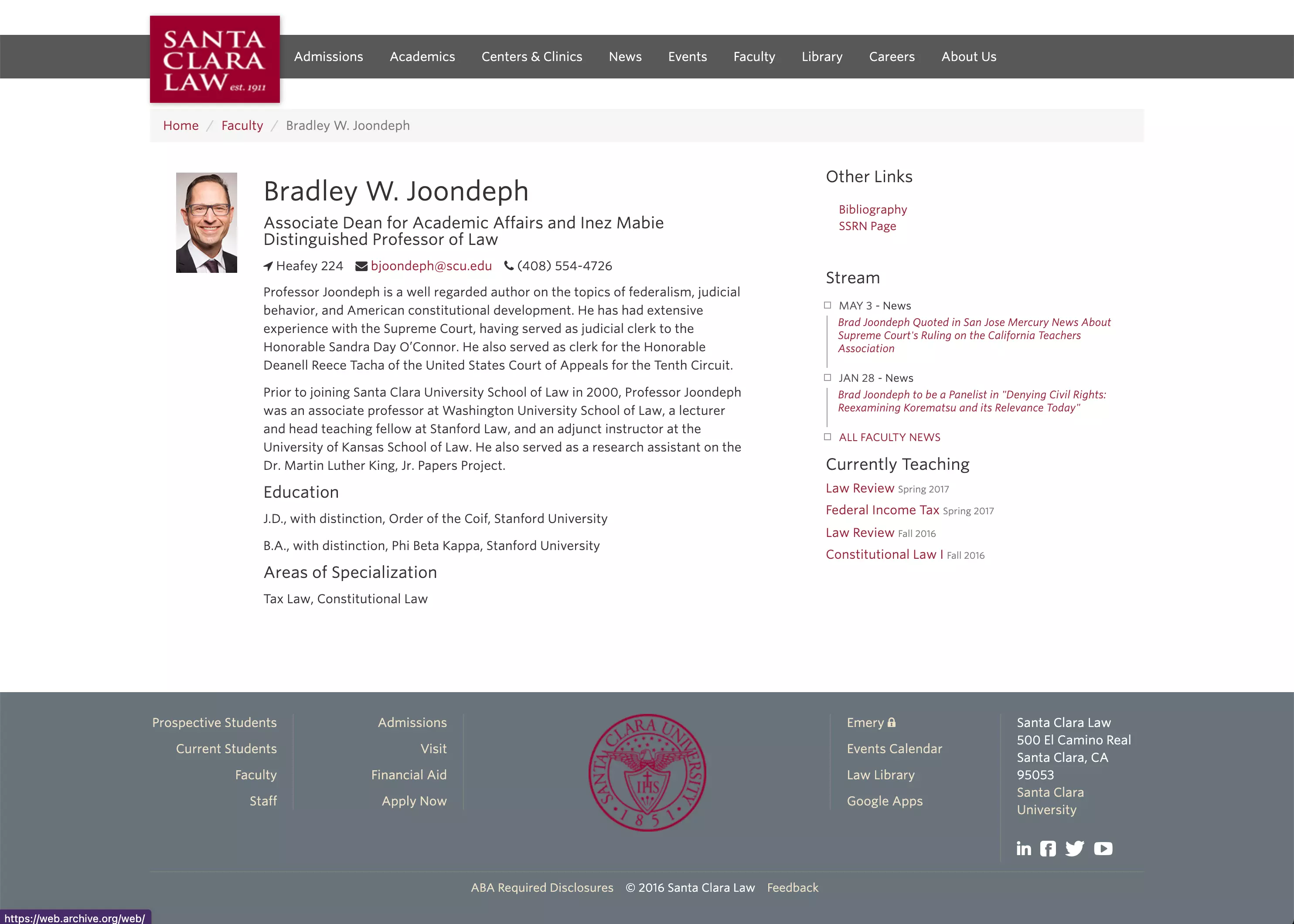
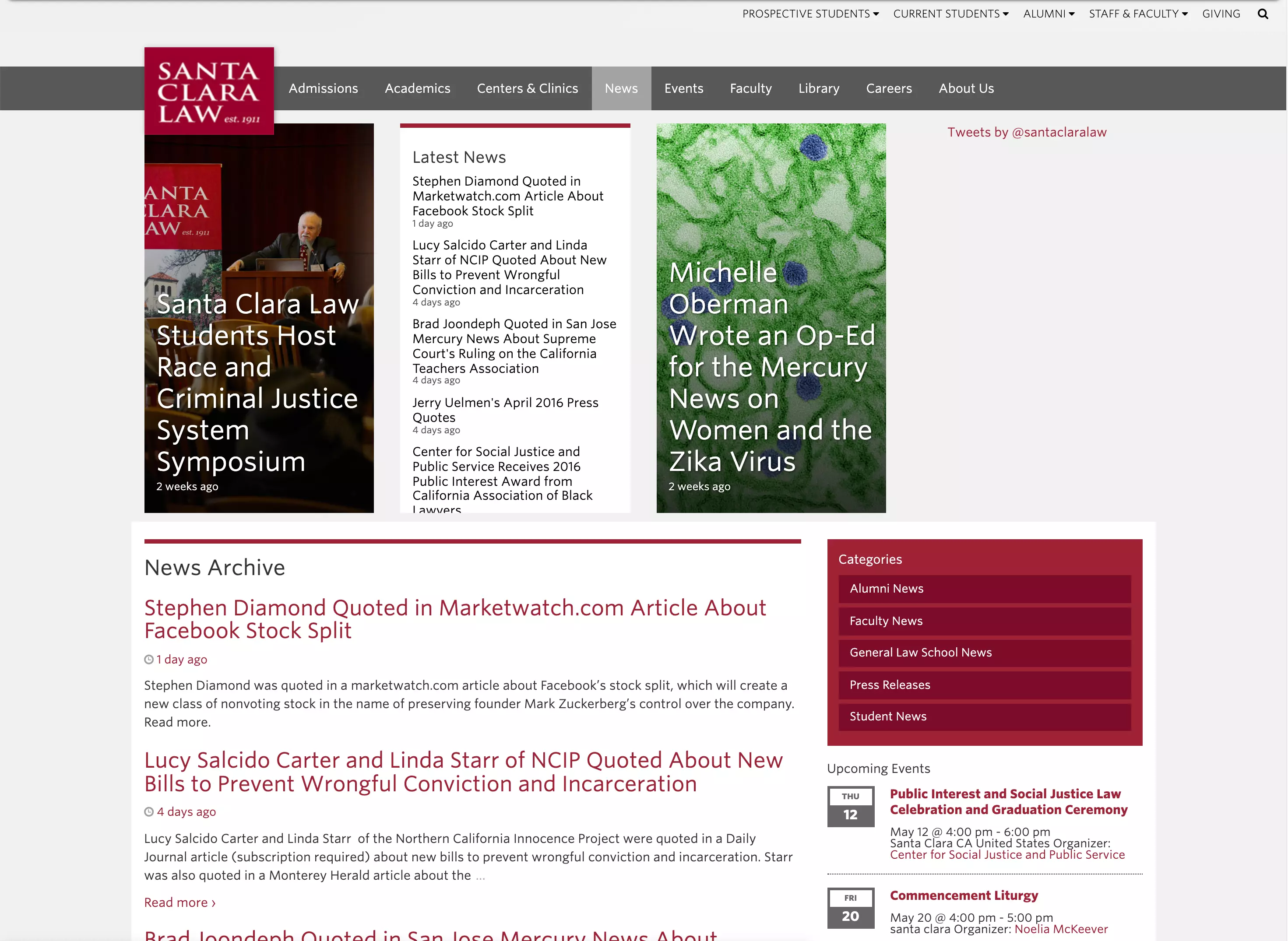
Santa Clara Law Websites/Intranet
Designed, coded, and launched Law's industry-first responsive website with a team of four, which improved task success of key metrics by 10%. Deployed Law's intranet with course planning. Created touch kiosks for students and faculty.
2011
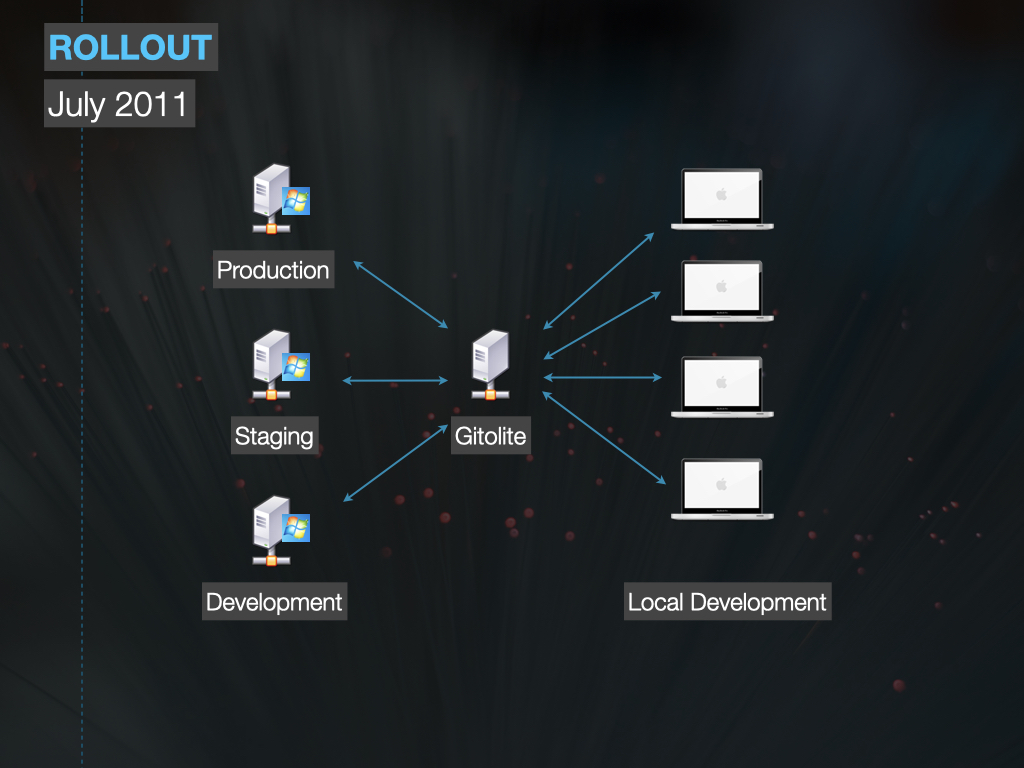
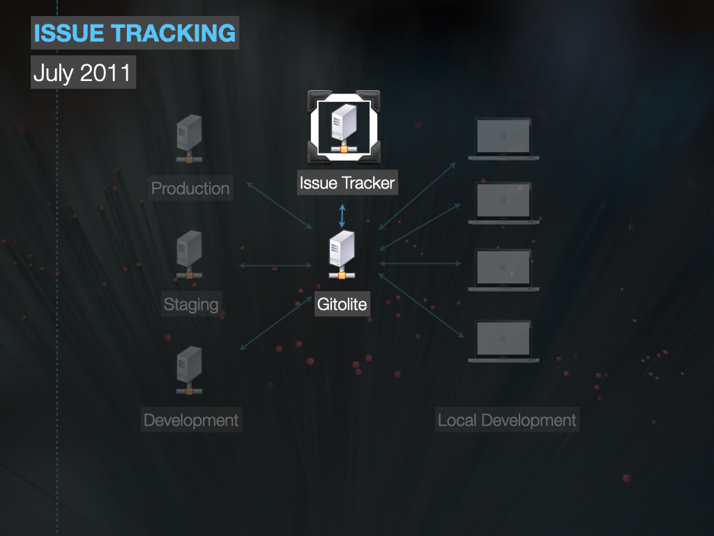
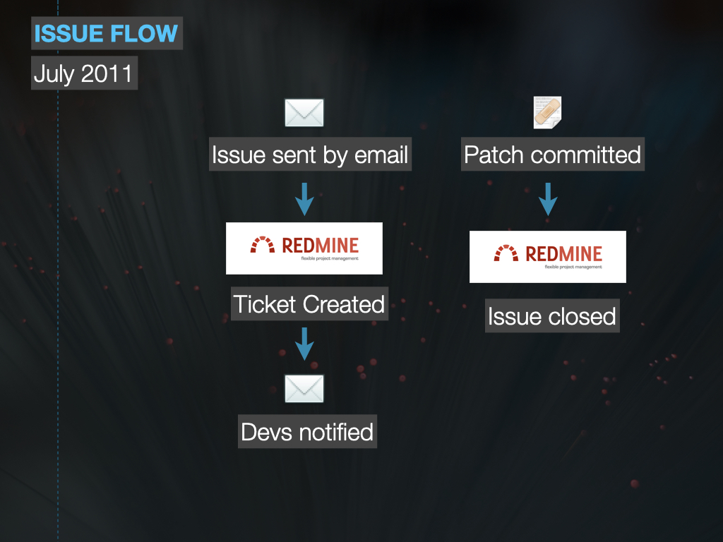
Git/Redmine Conversion
Modernized version control and enabled agility by connecting user stories to code automatically.
Selected Presentations and Speaking
2020
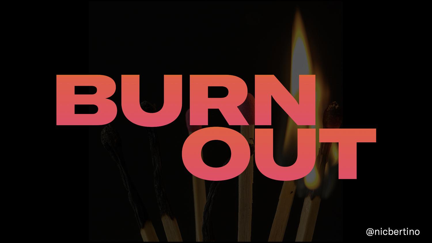
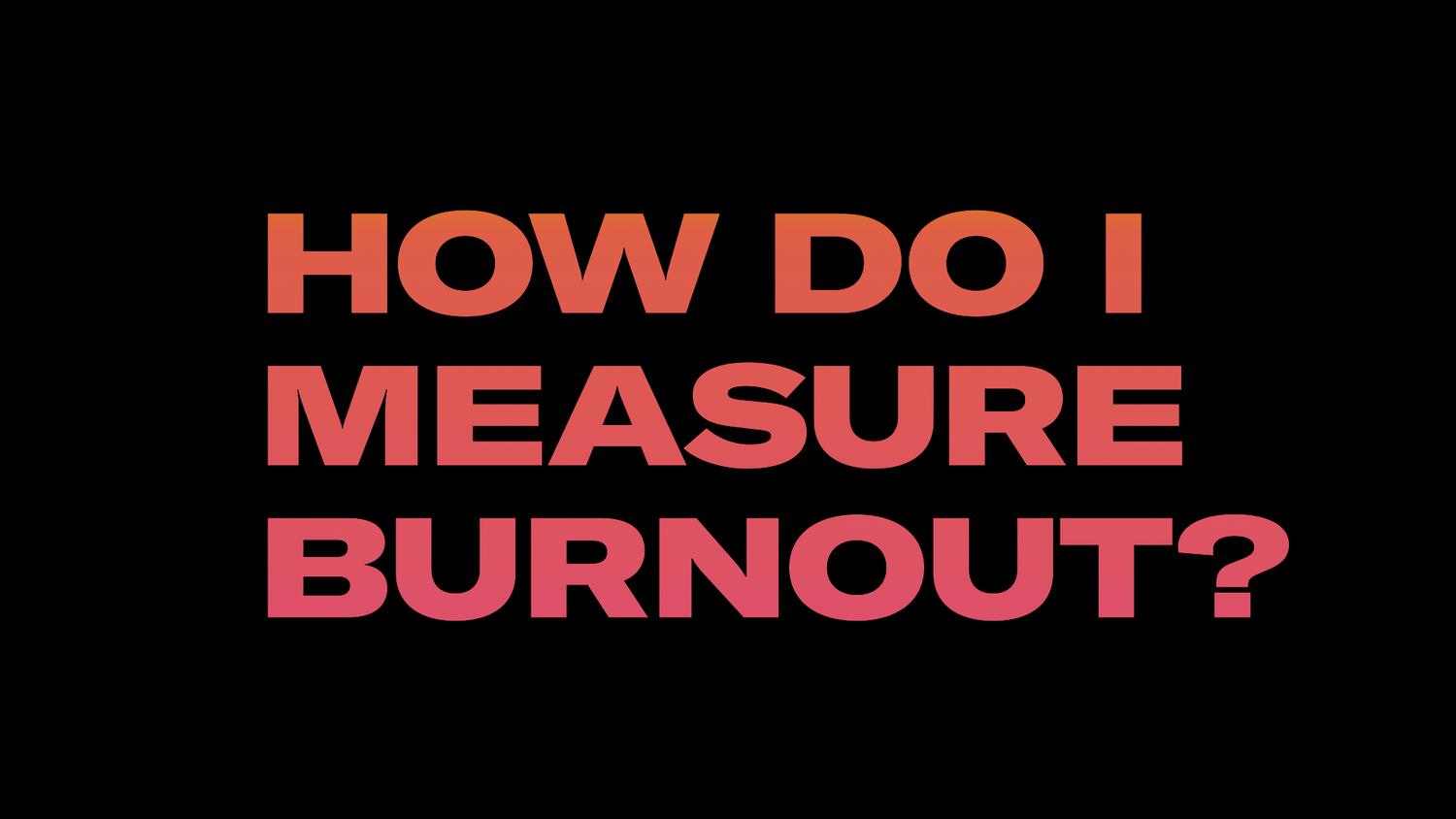
Burnout
Focuses on how people (and people leaders) can better understand what drives burnout in life and the workplace. It critically examines the drivers/resources model and adds core engagement to help people better understand how to stay happy, healthy, and engaged at work.

2019
Your Tragic Design
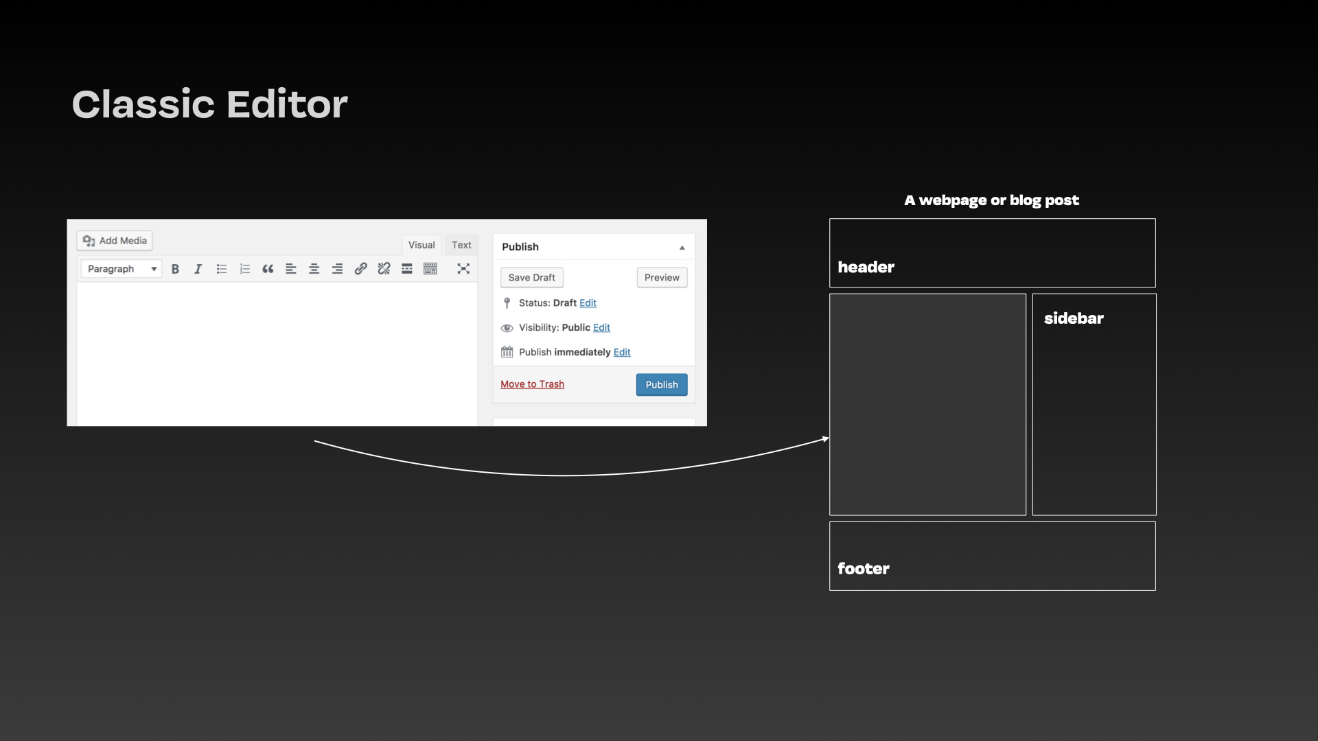
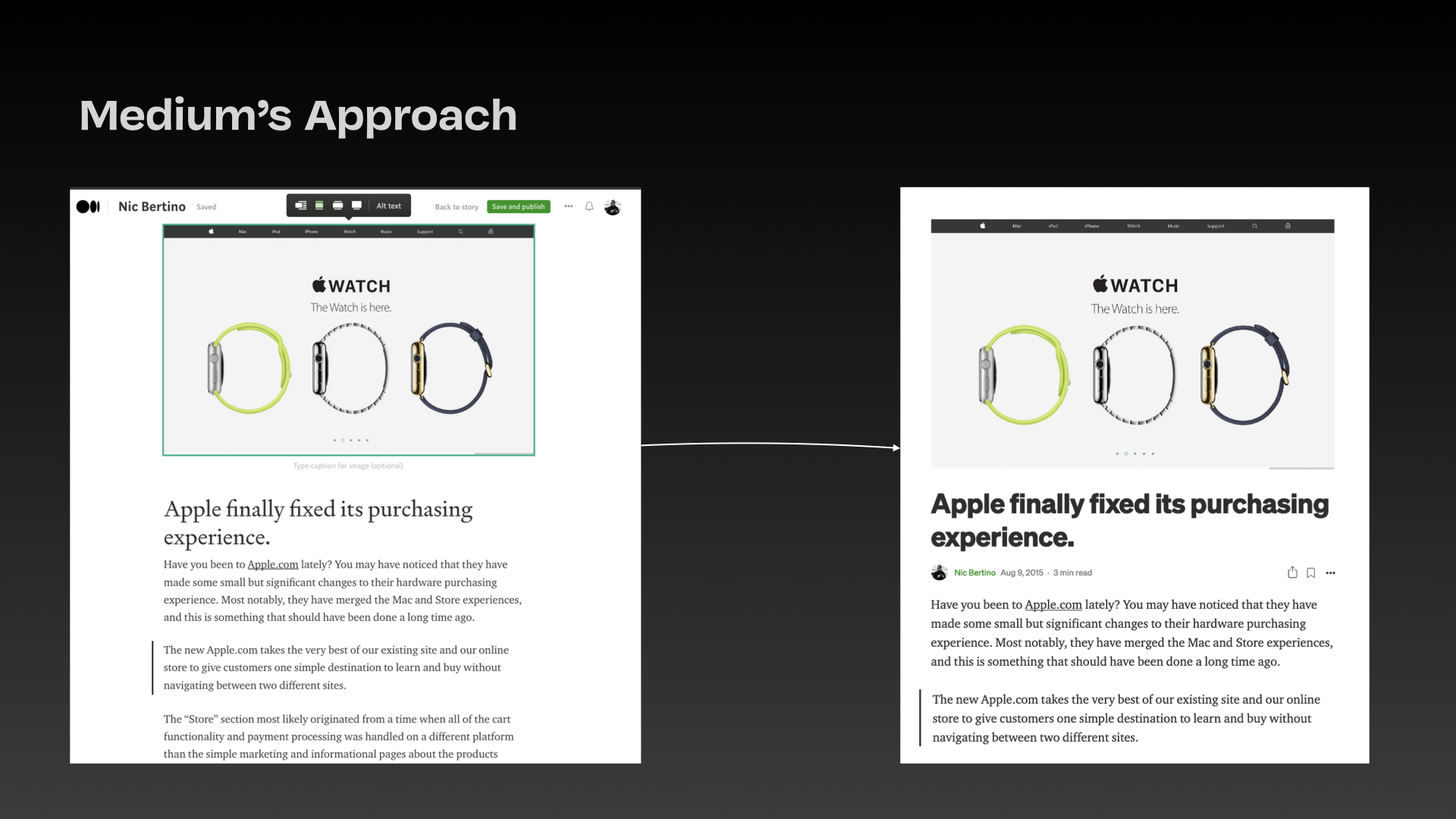
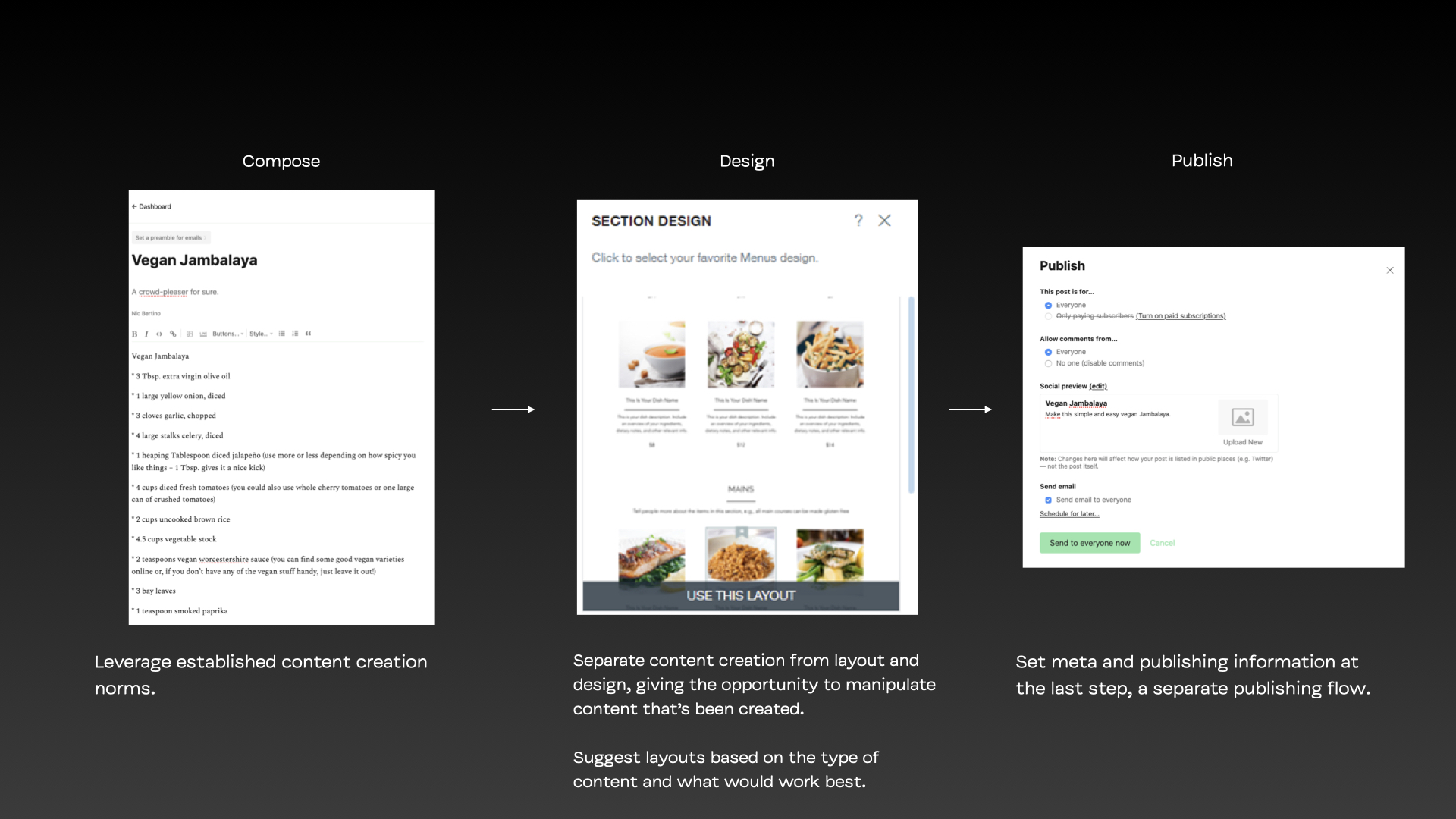
The community met WordPress' Gutenberg editor with near-universal contempt upon its launch in 2018. This case study critiques the product's design, its inherent inaccessibility, and how MVP and Agile were used to justify exclusive design, told by a volunteer on the community Accessibility team.
2011
Modern Version Control
Our small team working in academia successfully transitioned to Git and created a distributed version control system with issue tracking (a la GitHub) using open source tools. We shared how we made it happen.